I've recently been doing some ad-hoc testing at work, and it seems like my process could be improved somewhat. I'm tasked with testing a web application that I'm not exceedingly familiar with. At first, I am just going through the application with IE6 and trying out various functions or details and making sure that things look and behave appropriately with strange inputs. When I see something anomalous or a particular page that looks complicated or strangely laid out, I dig a little deeper and try to see what I can break. I figure that it's these sections that are the most likely to contain bugs. Taking screenshots of likely bugs has been helpful in entering them accurately into our bug tracking system and will hopefully avoid ambiguity in what I'm seeing for whoever tries to fix the bug, which will then require less communication overhead for me.
I heard Mike Kelly talk a bit about exploratory testing, and it seems like what I have recently been trying is similar to this technique. Essentially, exploratory testing is ad-hoc testing's bigger, more refined brother. Instead of just willy-nilly testing things, you have a designated goal and you create a plan that you try to stick to. When you see something interesting or have a clever thought on how to test that things are well done, you can venture off of the path for a bit and explore that idea. In this way, you can use your intuition as well as having a way to document and hold yourself accountable for the testing that you are doing.
Of course, this doesn't work for all applications, but it seems like it's useful for my case. I just realized that this is a pretty cool subject, something that gives ad-hoc testing more value and more credibility as a testing methodology. This is vague and my understanding limited, so if you want more information, check out the Wikipedia entry for exploratory testing for starters, along with James Bach's PDF that's there.
Image recognition
It seems like we could improve on verifying the look in all of the browsers we are tasked with using (IE6 & 7, FF 2 & 3.) It would be best if the site looks essentially the same on all browsers at the supported resolutions. At this time, however, the CSS is not very well decoupled, so what happens is that someone changes the CSS on one page, and somewhere else something is misaligned on one of the browsers or something. It's time consuming to verify just one page on all browsers, let alone pages that you don't think might have been modified. This leads to mistakes because we are not getting feedback quickly enough.
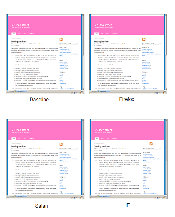
To mitigate these mistakes, we might employ a technique mentioned at the September IWST. You create a script that goes through the site for the supported browsers and takes screenshots of them at the supported resolutions for all of the pages on the site. You have a baseline of some sort, which is how things looked when you last got latest from the repo. Then, if you make any style changes, you run the script and look to see if anything changed. If things look good, you check in. If not, you know and fix them. By making the right choice easier, we improve the quality of our product.
Pop Quiz
So, which one of these blogs is not like the others?

Well, it was kind of a silly quiz, you probably already knew that it was going to be IE that was going to be different. :) (RSS icon) Kind of reminds you of those "find the six things that are different between these pictures" things in the Sunday comics?
The point here is that it's pretty quick and painless to go through the site and see if there are any major differences between what the site used to look like and what it will look like after you check in. It should ideally take less than ten minutes to go through the entire site if you didn't mess anything up. This is much better than using some fully automated system, because you can disregard changes that are irrelevant (for example, the changes that you presumably made for this check-in.) I would envision the images being considerably larger so that you could see differences, but you get the idea.
It seems like this should be something someone has already solved. Is there an open-source product that you know of that does something like this? I don't think that a solution where we allow an external service to view the pages is applicable. Perhaps a Selenium solution of some sort, but this seems somewhat expensive to create. One thing that would be very handy would be to be able to see the entire contents of the page (not just one vertical screen's worth of information.) This combats the problem where the top half of a long page looks correct but the bottom half is messed up.